1media/macleans_51_ad_thumb.jpg2025-03-23T21:49:51-04:00Catriona Nguyen0f99deda97ccbdb941b6047d7bf08b87bb51fad41355A 1951 Maclean’s Magazine ad for Northern Electric, showing off three radio models: the Panda, the Baby Champ, and the Midge.plain2025-03-28T00:14:17-04:001951Maclean’s Magazine. 1951. New and Exciting Northern Electric ad. Advertisement. Northern Electric. https://northernelectric.ca/radios/print/macleans_51_ad/macleans_51_ad.htmNorthern ElectricMarch 23, 2025.Catriona Nguyen0f99deda97ccbdb941b6047d7bf08b87bb51fad4
1media/6225185.jpg2025-03-25T19:36:12-04:00“Look at Me! How Was I advertised?”14A brief analysis of Baby Champ 5110 and Northern Electric Radio ads shows two features of this radio that were capitalized in its marketing campaign: it’s cheeky name and its beautiful colourways.plain2025-03-28T08:06:02-04:00
The Name
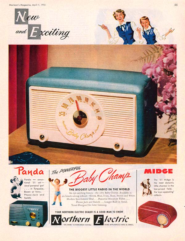
In a 1951 Northern Electric ad published in Maclean’s Magazine, highlights the unique names Northern Electric gave their models—not only did it feature the Baby Champ, but the “Panda” and “Midge” radios as well, with supporting language that pointed out each attractive radio such as “ideal personal pet”, “eye-catching”, “breath-taking”, and “eye-appealing.” It’s possible that using these unique and more importantly, accessible names held appeal to certain consumer groups, and were more effective than using only model numbers or technical jargon. In addition, Baby Champ Radio ads were often accompanied with the tagline “The Biggest Little Radio in the World”, signalling to potential buyers and consumer groups that the Baby Champ radio was in high-demand.
The Colours
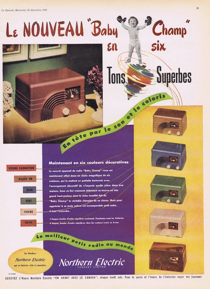
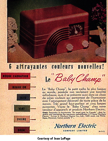
Alternatively, notable magazine ads in Reader’s Digest and Le Samedi released in 1947 focus on showing off the visual and functional appeal of this radio. Below, both posters make it a point to include all variations of colours these radios come in, including specific labels that depict the official shade names. Having official names for these color variations likely helped potential buyers to feel a sense of connection and personal identity when selecting their preferred shade. In addition to this, both posters feature similar language when speaking about the product, such as “this radio possesses not only a melodious tone, but also a choice of pretty colours that harmonize with the decorative arrangement of any part of the house”. Using such language identifies this radio not just as a beautiful object, but also a holistic part of the home and overall spatial environment, redefining its advantages in the lives of its users. In emphasizing the power of colour, the Baby Champ radio employs the idea of functional colour—the belief that colour could be a tool for tapping into human emotions and creating a more efficient and pleasing environment (Blaszczyk 2016, 18-29). Postwar, this transformation of colour was said to increase the need for better design and the need to improve daily life. As design and colour became increasingly influential sales factors—eventually ranking alongside price and performance—manufacturers placed greater emphasis on aesthetics in marketing (Blaszczyk 2016, 240). This shift explains why the Baby Champ 5110 was promoted so heavily for its visual appeal.
These promotions and advertisements served to present the radio as a common household item, both perpetuating and relying on preconceived ideas of beauty and status that allowed it to resonate with the visual and material culture of the home and, ultimately, were a major influence in the formation and development of radio culture.
You can read more about the development and impact of radio culture by clicking below!